Artio Project Overview
The product:
Artio is an art audio tour app focused on the New York City area. Artio strives to deliver high-quality, engaging, and detailed audio tours. The app targets serious art enthusiasts and casual tourists looking for high-quality audio tours quickly so they can focus on enjoying themselves and creating memories.
The problem:
Art lovers and tourists spend too much time looking through multiple sources to try and find an art audio tour that interests them.
The goal:
Design an app for art enthusiasts and casual tourists that acts as a single source and allows users to easily choose engaging art audio tours based on current events, artists, museums, and locations.
My role:
UX designer and UX researcher designing an app for Artio from conception to delivery.
Responsibilities:
Conducting interviews, paper and digital wireframing, low and high-fidelity prototyping, conducting usability studies, accounting for accessibility, and iterating on designs.
Understanding The User
Summary:
I conducted interviews and created empathy maps to understand the users I was designing for and their needs. A primary user group identified through research was young professionals living in large metropolitan areas and casual tourists interested in the arts.
This user group confirmed initial assumptions about Artio’s users. Research also revealed older adults comprised the majority of the tourists user group, and the user flow needed to be simplified and streamlined to make the user experience intuitive. Thoughtful use of icons was a great help to this user group.
Pain Points!
No one likes them.
Time
“It takes a long time looking at multiple websites and apps to find the audio tour I want.”
Language barrier
The inability to understand a local language, difficulty hearing guided tours, and missing information about the art subject lead to people abandoning tours.
Crowding
Crowding around descriptions of artwork for a chance to read about the artwork & artist.
Personas
Sarah Ali:
Problem statement:
Sarah is a young professional working at an art auction house who needs an audio tour app with deep and detailed information about the artist because this will help her advance in her career.
Carlos Maza:
Problem statement:
Carlos is a grandfather and art lover who needs an easy-to-use art audio tour app in his native language because he isn’t good with technology and wants to understand the audio tour easily.
User Journey Maps
Mapping Sarah’s user journey revealed how helpful it would be for
users to have access to a dedicated Art Audio Tour app.
Mapping Carlos’s user journey showed how frustrating using an app can be when products don’t take into consideration age, language, and cultural barriers.
Starting The Design
Digital Wireframes
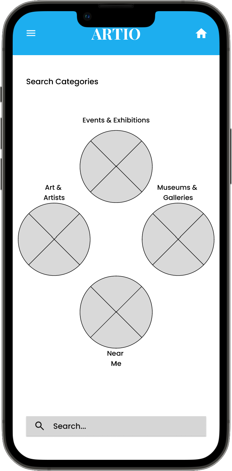
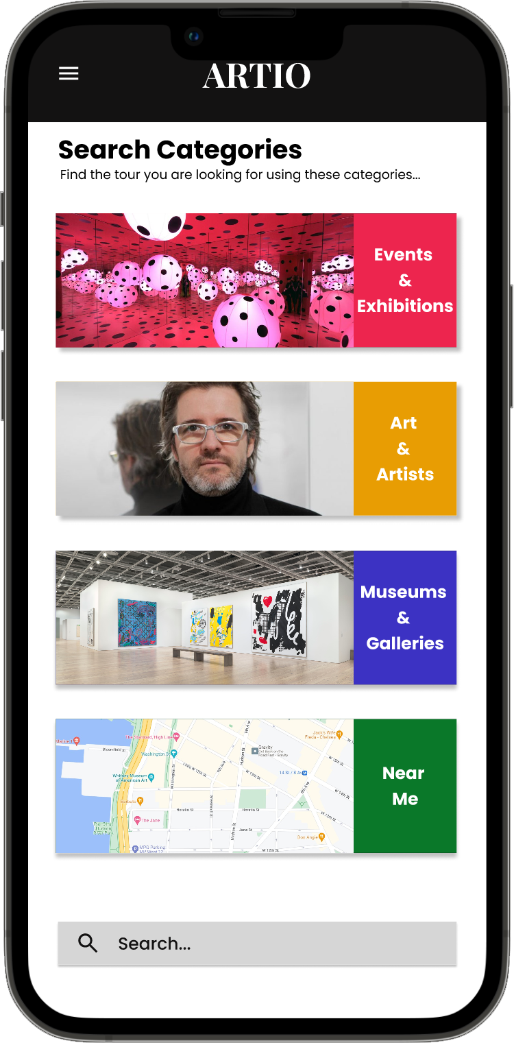
In the initial design phase, I wanted to make sure the “Search Categories” made logical sense and helped to shorten a user’s search time.
The “Search Categories” function as the primary means that a user would search for an audio tour based on the most likely search parameters.
The search button allows the user to jump the search categories if they exactly what they are looking for.
Digital Wireframes
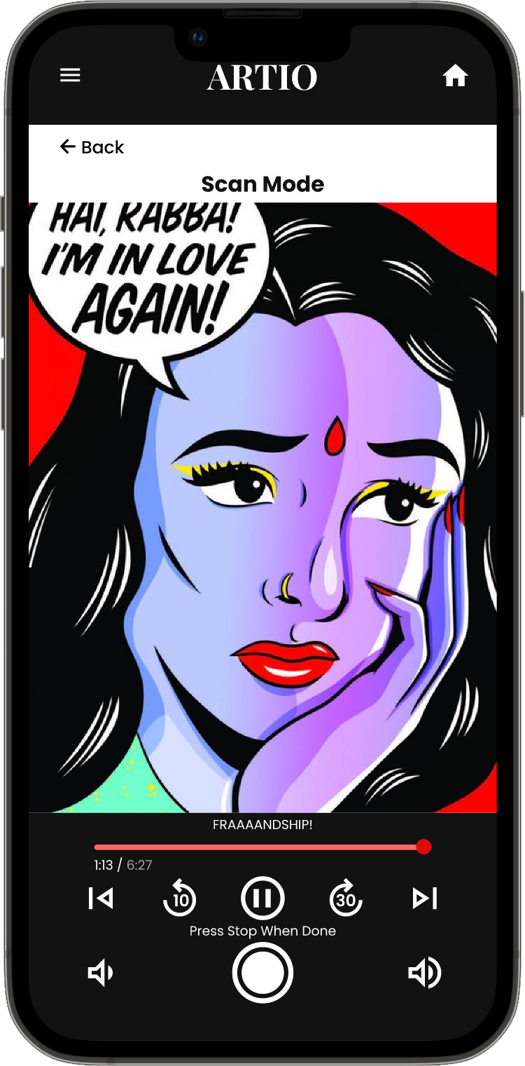
The primary function of the Artio art tour app is the audio tour itself. The simplicity of design and ease of use was the focus of the Audio Tour Screen.
Picture mode scans the image and loads the narration for the artwork
Simple user controls avoid mistakes.
Low Fidelity Prototype
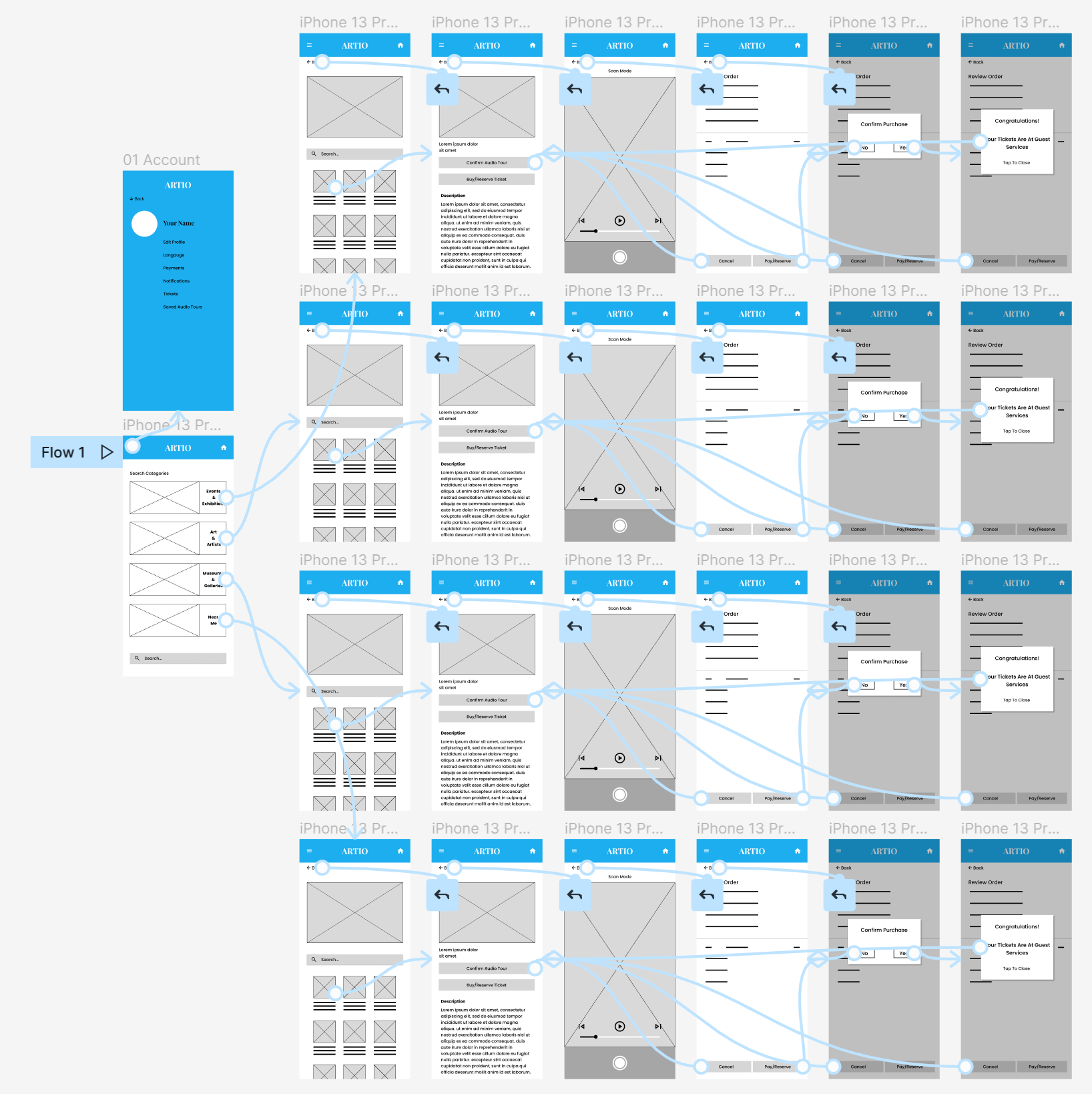
Using the completed set of digital wireframes, I created a low-fidelity prototype. The primary user flow I connected was based on selecting an audio tour, booking a ticket for the museum or gallery, and playing the audio tour.
Usability Study Findings
Using the completed set of digital wireframes, I created a low-fidelity prototype. The primary user flow I connected was based on selecting an audio tour, booking a ticket for the museum or gallery, and playing the audio tour.
Round 1 Findings
Users want better cues on how to search for an audio tour.
Users wanted a calendar during ticket purchases.
Users want clear wording indicating how to start an audio tour.
Round 2 Findings
Users felt the audio tour controls were a little confusing.
Users wanted the search categories to be better organized
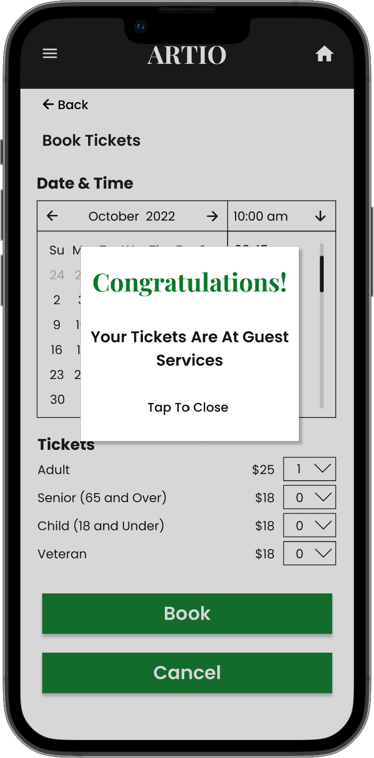
Users wanted an e-ticket option instead of a ticket waiting at guest services.
Refining The Design
Mockups
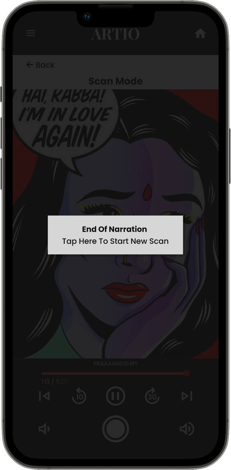
The second usability study revealed that users were annoyed that they had to press the stop button after the narration stopped in order to start a new scan.
I streamlined the process.
A pop-up button appears at the end, and when pressed would start the scan mode over again.
Before Usability Study
After Usability Study
Mockups
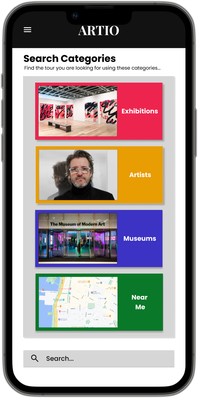
Early designs showed the categories clustered together in a diamond pattern, but after the usability studies, I reordered the “Search Categories.” into a grid. I went through several iterations, some with color and some without color. The version without color was more cohesive, but in the end, users described the color version as more fun.
Before Usability Study
After Usability Study
Mockups
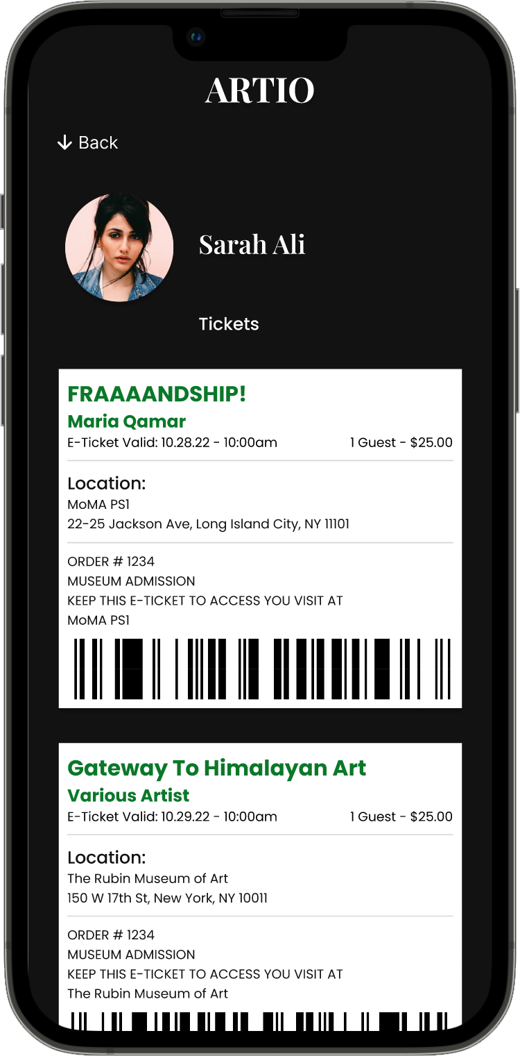
The second usability study revealed a desire for an E-Ticket instead of retrieving your ticket from guest services. This had the bonus of reducing the pain point of waiting in line and streamlined to process of visiting the museum.
Before Usability Study
After Usability Study
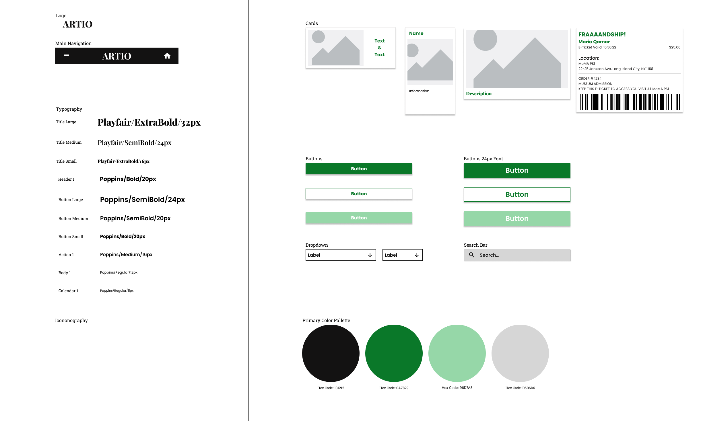
Sticker Sheet
Mockups
High Fidelity Prototype
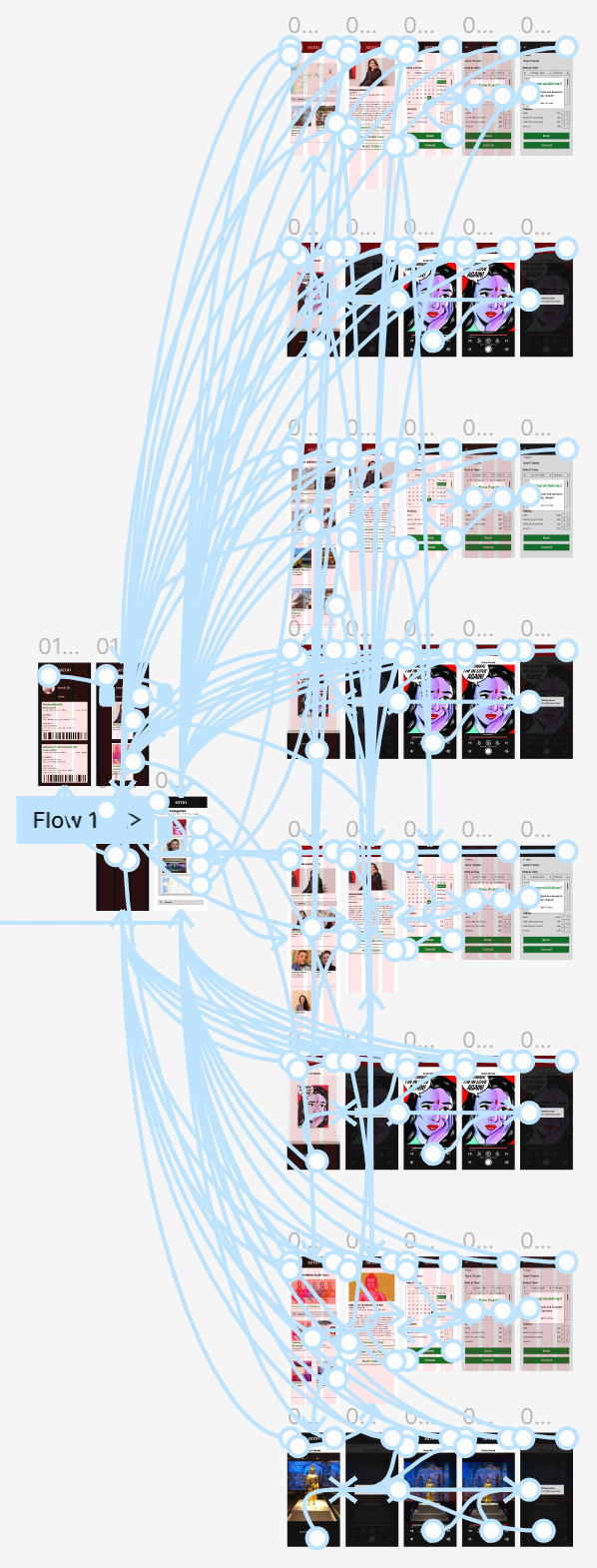
The final high-fidelity prototype presented cleaner, more streamlined user flows for finding audio tours. It also met a new user need for booking e-tickets.
Accessibility Considerations
Provided access
to users who need the assistance of screen readers and switch devices.
Provide additional languages to navigate the app and audio tours in additional languages.
Use icons to help make navigation easier.
Going Forward
Takeaways
Impact:
The app meets the user’s needs for a high-quality audio tour and provides more in the way of streamlining a visit to the museum, potentially increasing museum patronage.
One quote from peer feedback:
“I can see myself using this app regularly. Even if I didn’t use the audio tour portion, I would use it to see what exhibits are opening and if there are new artists.”
What I learned:
While designing the Atrio app, I learned to trust the process. My preconceptions were challenged and new ideas emerged from unexpected sources. Usability studies and user feedback influenced each iteration of the app’s designs.
Next Steps
Iterate on the prototype to create a more engaging home page.
Conduct another round of usability studies to ensure that changes made improve the overall user experience.
Conduct more user research to determine any new areas of need.


