HomeAway Project Overview
The Product:
HomeAway is an app that provides high-quality, well-designed, and curated vacation rentals to large groups, extended families, and people with disabilities. The typical user is between 24-70 years old, and most users are young professionals, families, and retirees. HomeAway’s goal is to make the process of finding and booking the perfect vacation home to be a fun and easy process.
The problem:
Current vacation home rental websites seldom prioritize vacation homes for large groups, extended families, and people with disabilities. Users often have to spend more time trying to find exactly what they are searching for, and suggestions often don’t align with the actual needs of the target user group.
The goal:
Design a vacation rental website to be user-friendly by providing clear navigation and focus on offering a wide selection of homes for large groups, families, and people with mobility disabilities.
My role:
UX designer and UX researcher designing an app for HomeAway from conception to delivery.
Responsibilities:
Conducting interviews, paper and digital wireframing, low and high-fidelity prototyping, conducting usability studies, accounting for accessibility, iterating on designs and responsive design.
Understanding The User
Summary:
I conducted user interviews, which I then turned into empathy maps to better understand the target user and their needs. I discovered that many target users seek larger homes to accommodate six or more people. Many of these users are planning vacations for a group of friends or extended families. However, many vacation home rental websites focus primarily on short stays for groups of four or fewer and often do not focus on the needs of people with children.
In addition, the needs of users with disabilities were often placed last, lengthening their search. Users with disabilities can spend hours looking for rental homes that accommodate them.
Pain Points.
Time
It takes a long time to look at multiple home options to find rentals that suit large groups, extended families, and people with disabilities.
Filters
Filters were often esoteric or not reflective of the needs of parents and people with disabilities.
Crowding
Users were frustrated because service fees and cleaning fees were often not displayed prominently and not in the breakdown of the total cost before finalizing payment.
Personas
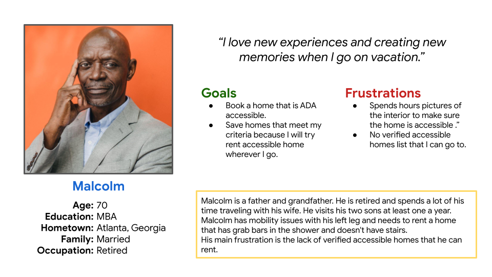
Malcolm Simms:
Problem statement:
Malcolm is a retiree with a disability that reduces his mobility and needs to rent an accessible vacation home because he has trouble going up and down stairs and getting into and out of the shower without help.
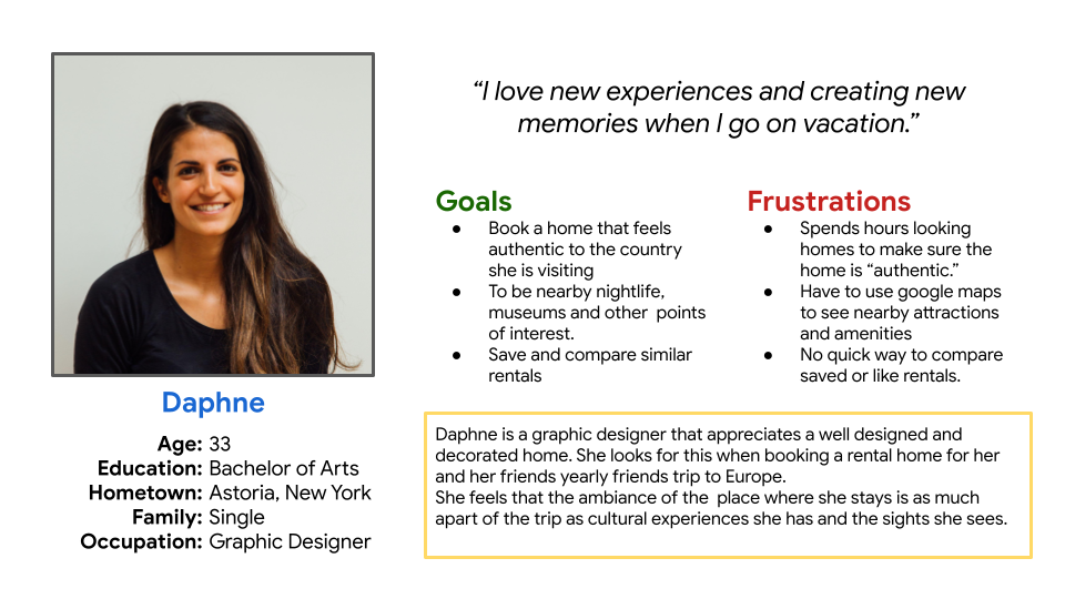
Daphne Ioannidis:
Problem statement:
Daphne takes a trip to Greece yearly with some of her closest friends and spends a long time looking for the right size home to accommodate six or more guests. It is frustrating for her when she finds the right rental home only to find it isn’t located close to any points of interest.
User Journey Maps
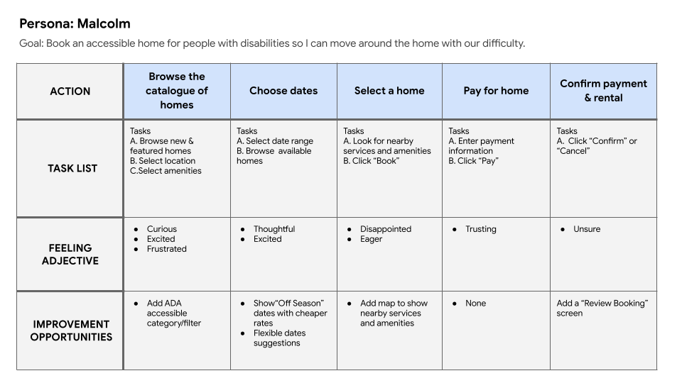
Mapping Malcolm’s user journey revealed how helpful it would be for
users to immediately identify ADA-accessible rental homes
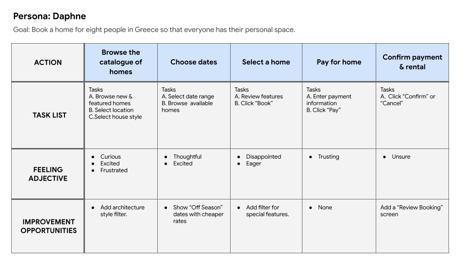
Mapping Daphne’s user journey showed a need to show pricing upfront and special filters to find the right kind of rental home.
Starting The Design
Sitemap
Difficulty with website navigation can be a pain point for users, so I used that knowledge to create a sitemap that was simple and minimal in its organization.
The goal was to make strategic information architecture decisions that would streamline website navigation.
Paper Wireframes
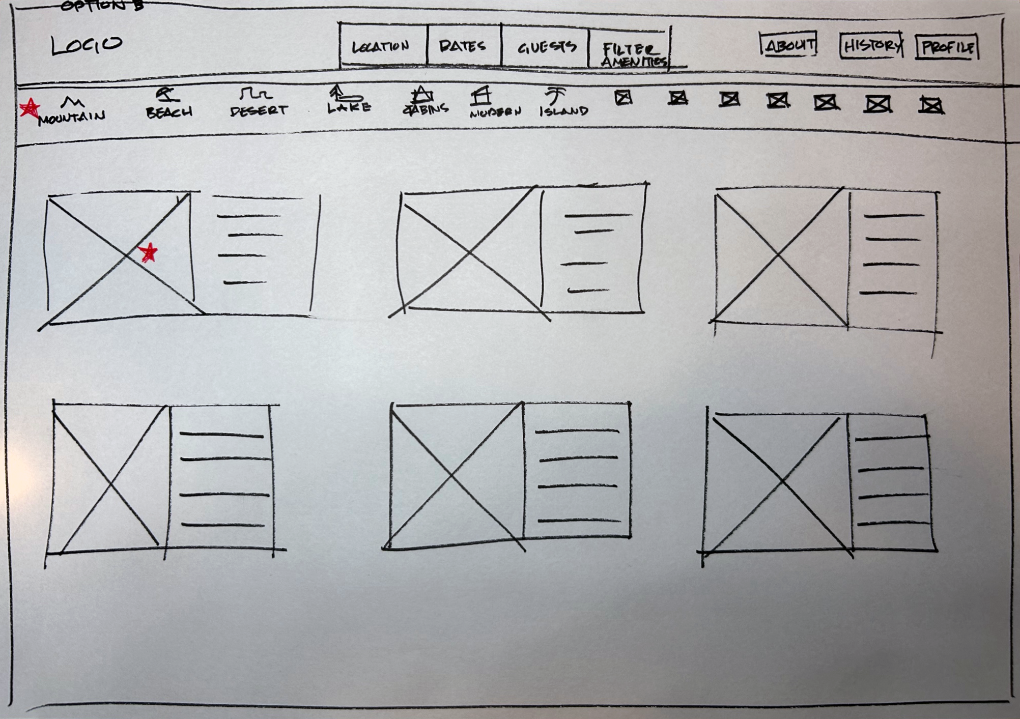
Next, I sketched out paper wireframes for each screen in my app, keeping the user's pain points about navigation, browsing, and checkout flow in mind.
The home screen paper wireframe variations to the right focus on optimizing the browsing experience for users.
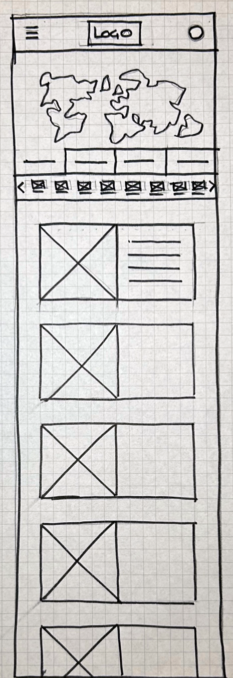
Paper Wireframe Screen Variations
Because HomeAway customers can access the site on a variety of different devices, I started to work on designs for additional screen sizes to make sure the site would be fully responsive
Digital Wireframes
Moving from paper to digital wireframes made it easy to understand how the redesign could help address user pain points and improve the user experience.
Prioritizing the search filter and visual element placement on the home page was a key part of my strategy.
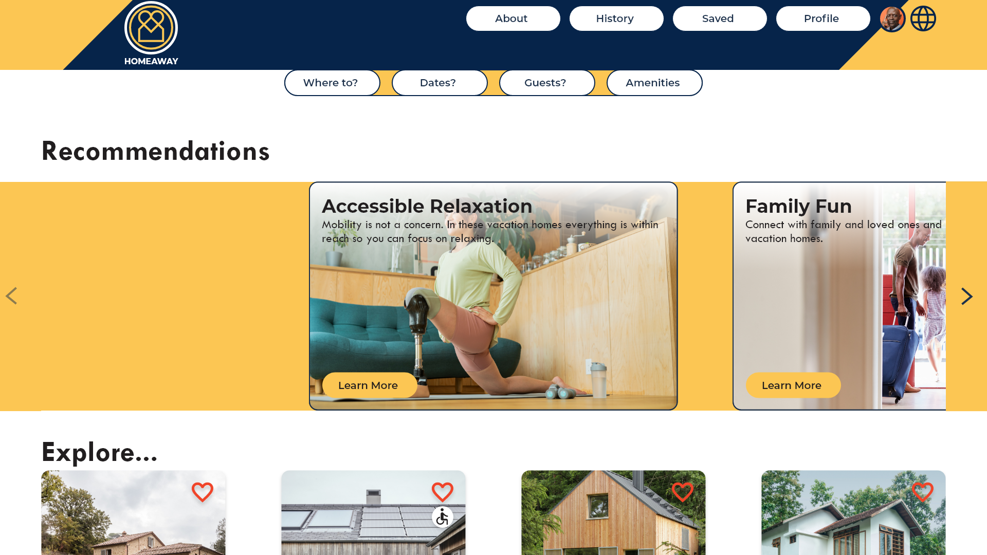
The homepage shows popular vacation destinations and ideas on themes of interest to users.
The search filter is prominently displayed so that users may begin their search right away.
Digital Wireframes Screen Size Variations
Low Fidelity Prototype
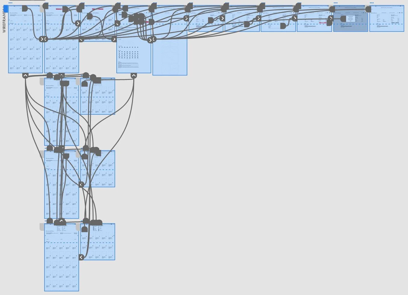
To create a low-fidelity prototype, I connected all of the screens involved in the primary user flow of adding an item to the cart and checking out. At this point, I received feedback on my designs from members of my team about things like the placement of buttons and page organization. I made sure to listen to their feedback, and I implemented several suggestions in places that addressed user pain points.
Usability Study Findings
Checkout
Once at the checkout screen, users wanted a way to confirm their payment was received, and the booking was reserved.
Accessibility
Users wanted a way to find homes that are disability friendly quickly.
Typeface
Some users expressed frustration with the size of the typeface being too small to read.
Refining The Design
Mockups
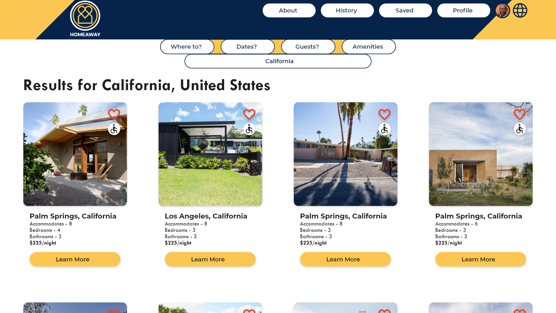
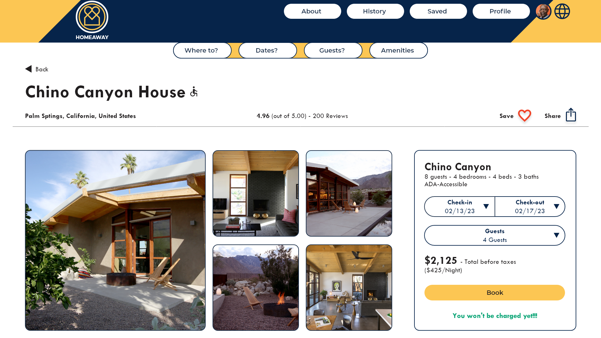
Based on the insights from the usability study, I made changes to improve the site’s checkout flow. One of the changes I made was adding an icon to show homes that are accessible for people with disabilities. This allowed users quickly identify homes that are more suitable to their needs without having to click on every home to do a more detailed review.
Before Usability Study
After Usability Study
Mockups
Based on insights from the usability study, users indicated that larger text and more prominent buttons would be helpful with user flow and navigation of the site.
Before Usability Study
After Usability Study
Mockups
Mockups Screen Size Variations
High Fidelity Prototype
My hi-fi prototype followed the same user flow as the lo-fi prototype and included the design changes made after the usability study, as well as several changes suggested by members of my team.
Accessibility Considerations
I used headings with different sized text for clear visual hierarchy
I used larger text for those with difficulty seeing small text sizes.
I designed the site with alt text available on each page for smooth screen reader access.
Going Forward
Takeaways
Impact:
Our target users shared that the design was intuitive to navigate through, images and icons were key to navigation, and the hierarchy was very clear to understand the user flow.
What I learned:
I learned that small design changes can have a huge impact on the user experience. The most important takeaway for me was that solving for a user group with disabilities made the user journey easier for all people.
Next Steps
Conduct follow-up usability testing on the new website
Identify any additional areas of need and ideate on new features
Identify any additional services that would complement vacation rental stays.


