Pathfinder Project Overview
The Product:
The app is designed to help veterans find mentors who are also veterans to assist them in transitioning into the civilian workforce. The app aims to connect veterans with mentors who can provide guidance and support as they navigate the challenges of finding employment after serving in the military. Pathfinder’s primary target users are all veterans, but primarily recently separated veterans.
The problem:
The military provides structure and has a clear chain of command. This does not naturally exist outside the military. A Veteran will have to create his or her own structure or adjust to living in an environment with more ambiguity.
The goal:
Design an app to ease the transition to the civilian workforce by providing a platform for mentors, who are also veterans, to connect with new veterans with a community of other veterans who understand the challenges you now face.
My role:
UX designer and UX researcher leading the app and responsive website design from conception to delivery
Responsibilities:
Conducting interviews, paper and digital wireframing, low and high-fidelity prototyping, conducting usability studies, accounting for accessibility, iterating on designs, determining information architecture, and responsive design.
Understanding The User
Summary:
I reached out to several veterans at various stages in their time outside of the military, and I asked them if they would like to answer a few questions and take a survey. Most interview participants reported feeling a loss of community and a lack of structure. The feedback received through research made it very clear that users would be eager and willing to work with a mentor to ease their transition but were cautious about the mentor being able to understand them because of their military background.
Personas
Adam Garza:
Problem statement:
Adam is a thirty-eight-year-old retired Marine Corps veteran who needs help writing a resume and preparing for job interviews because he hasn’t looked for a job in over twenty years.
Angela Ortiz:
Problem statement:
Angela is a soon-to-be veteran and mother of two. She needs help from a career counselor with a flexible schedule because she can’t meet during normal business hours due to her work and family responsibilities.
Competitive Audit
An audit of a few competitor’s products provided direction on gaps and opportunities to address with the Pathfinder app.
Starting The Design
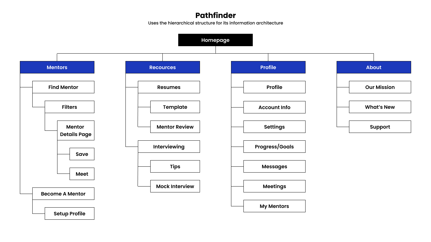
Sitemap
I started work on a sitemap to provide direction on how the app might be laid out. I intended to use the same sitemap to guide the organizational structure of each screen’s design to ensure the user experience stayed consistent across all devices.
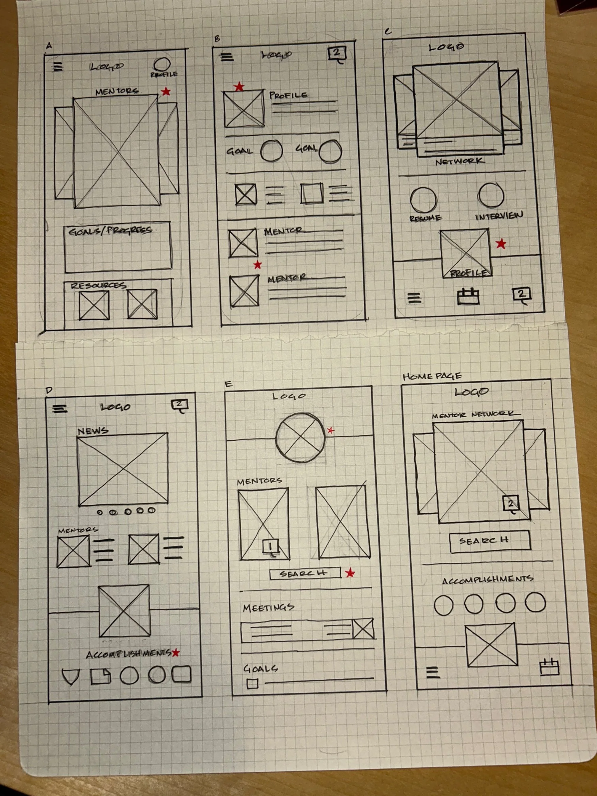
Paper Wireframes
Next, I sketched out paper wireframes for each screen in my app, keeping the user's pain points about navigation, browsing, and checkout flow in mind.
The home screen paper wireframe variations to the right focus on optimizing the browsing experience for users.
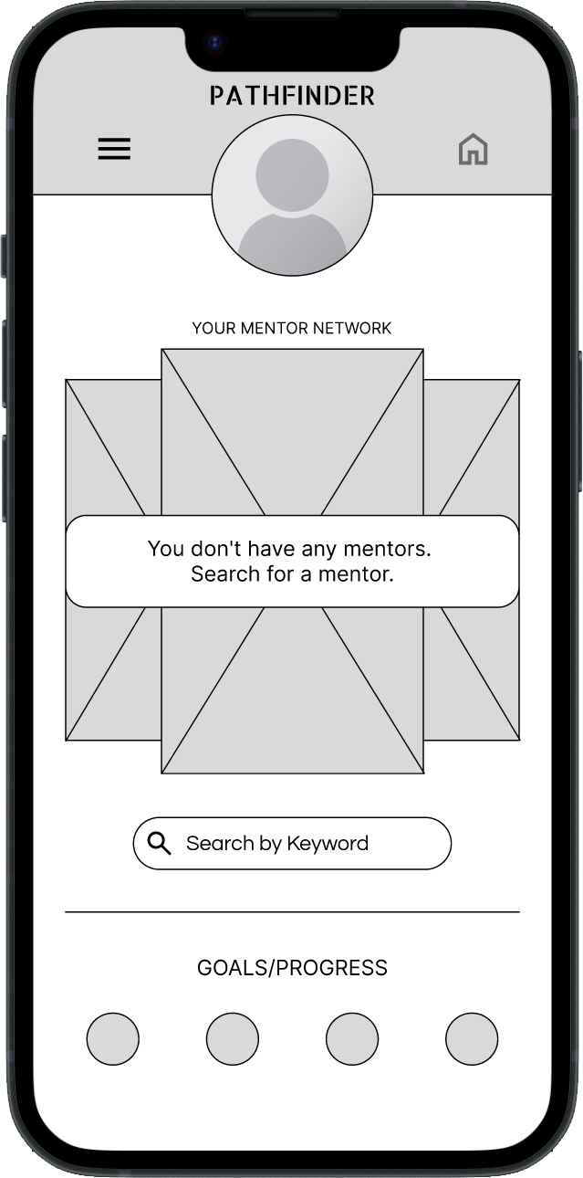
Digital Wireframes
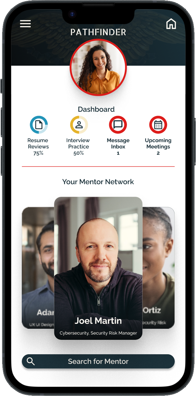
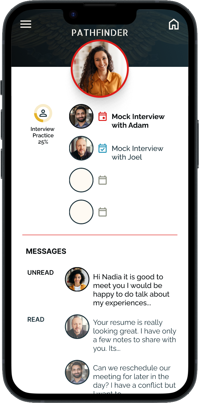
After ideating and drafting some paper wireframes, I created the initial designs for the Pathfinder app. These designs focused on the primary functions of interacting with mentors and managing the user’s progress toward goals
Top half of home screen is dedicated to mentor interaction.
Easy access to user’s profile.
The lower apportion is dedicated to user’s progress toward goals .
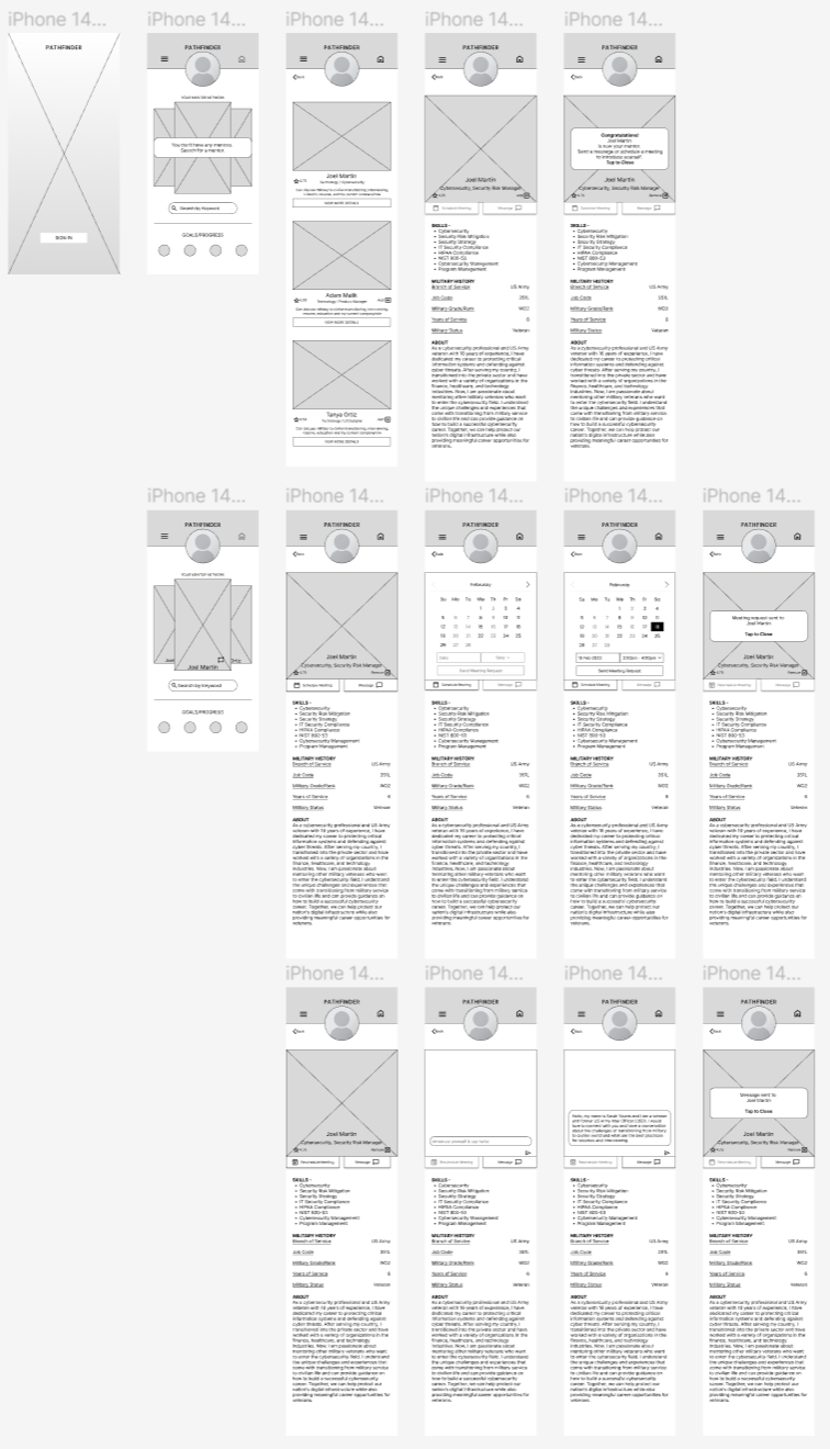
Low Fidelity Prototype
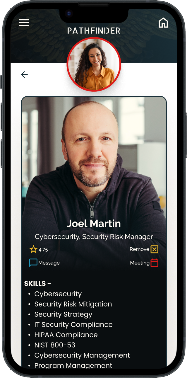
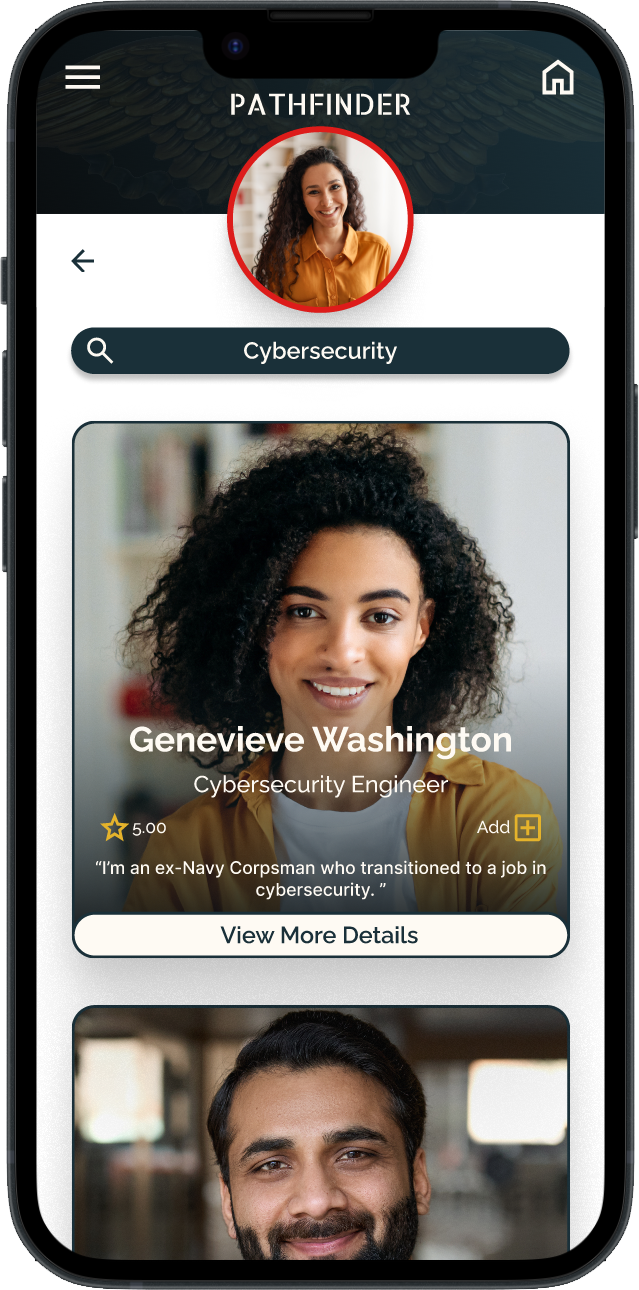
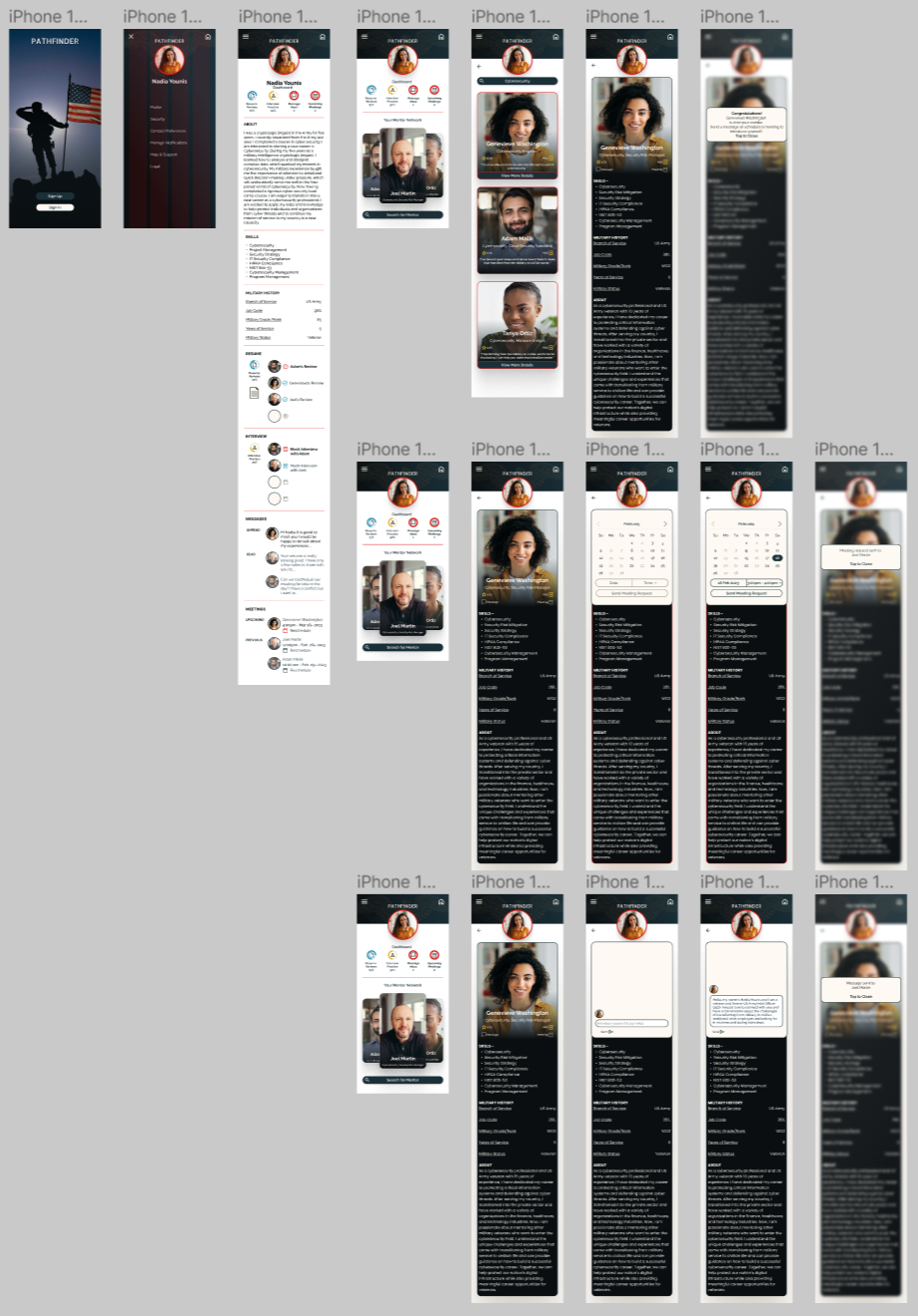
To prepare for usability testing, I created a low-fidelity prototype that connected the user flow of selecting and interacting with a mentor.
Usability Study Findings
Find A Mentor
People want the process of finding a mentor to be easy.
Meeting A Mentor
People had difficulty figuring out how to set a meeting with a mentor.
Icons
People wanted an easier and quicker way to identify the primary functions of the app.
Refining The Design
Mockups
The second usability study revealed that users were annoyed that they had to press the stop button after the narration stopped in order to start a new scan.
I streamlined the process.
A pop-up button appears at the end, and when pressed would start the scan mode over again.
Before Usability Study
After Usability Study
Mockups
Additional design changes included making sending a message and scheduling a meeting more clear/intuitive.
Before Usability Study
After Usability Study
Mockups
Sticker Sheet
High Fidelity Prototype
The high-fidelity prototype followed the same user flow as the low-fidelity prototype, including design changes made after the usability study.
Accessibility Considerations
Clear labels for interactive elements that can be read by screen readers.
The focus of the home screen is a dashboard configuration organized around the primary tasks or actions of the user.
Going Forward
Takeaways
Impact:
Users shared that the app gave them the camaraderie and sense of belonging that they had either lost or were afraid of losing. One user commented that having a set of goals specific to interviews and resumes provided the structure that they needed and were afraid of losing
What I learned:
I learned I learned that even though the problem I was trying to solve was a big one, diligently going through each step of the design process and aligning with specific user needs helped me come up with solutions that were both feasible and useful.
Next Steps
Conduct research on how successful the resume review and mock-interview functions work.
Add a mentor task list function
Provide incentives and rewards to users for transitioning from Mentee to Mentor.


